Try it at home! Satisfaction guaranteed!

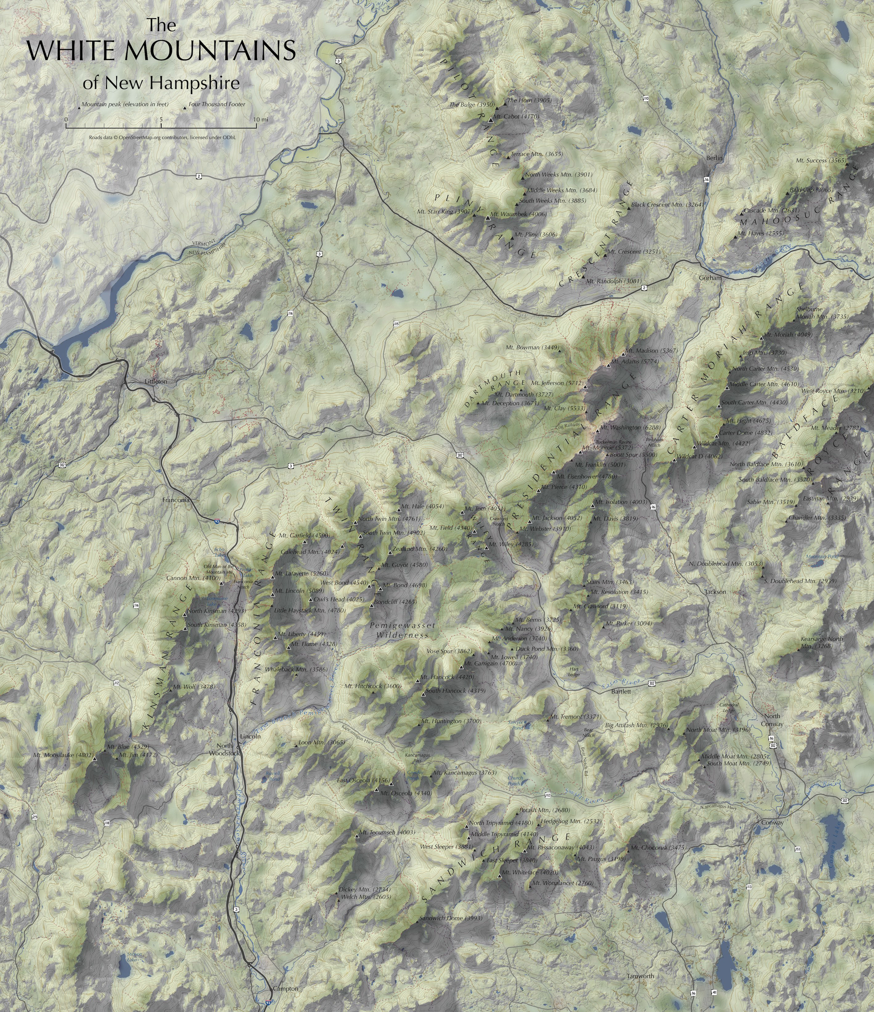
Continuing our recent theme of terrain-related side projects, a few days ago I finished (or, decided to quit working on) a shaded relief map of New Hampshire's White Mountains that I'd been pecking at from time to time for a few months. Most of our work is with interactive, web-based maps, and although we occasionally get to do more traditional static cartography (with hillshades, even), sometimes the kind of slow, singularly designed cartography we remember from our pre-web days has to be done just for fun.
It's satisfying to see a map come together piece by piece, as in the above animation showing the main steps and layers in producing this map. Cartography is rarely a matter of throwing data into software and getting a map in return; rather, a single map usually involves multiple tools and data sources, and a lot of attention to small details. (The same is true of web maps, by the way: we write a lot of code for small design details that push beyond defaults.)
There's no single way to make a shaded relief map, but here's how this one came together:
- Download a good digital elevation model from the National Map.
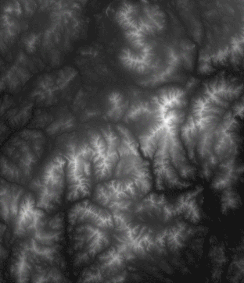
- Genereate a shaded relief image using Blender, per Daniel Huffman's excellent tutorial.
- Set up a QGIS project with land cover data. Reduce it to only a few colors (mainly, evergreen forest and "everything else") and export it with dimensions matching the relief image.
- In Photoshop, add land cover, then the relief layer with a "multiply" blending mode.
- Heavily blur the land cover so that it's not harsh and pixelated. It becomes a subtle base layer, not an essential piece of data.
- Add water lines and polygons (via Census TIGER/Line) to QGIS, style, export, and add to Photoshop above land cover.
- Use some Photoshop tricks to make relief highlights a bit brigher and warmer-colored, and shadows a cooler color.
- Generate and label contour lines from the DEM using QGIS, then export and add them as a Photoshop layer.
- Add roads (from OpenStreetMap via Geofabrik's extracts) to the QGIS project. Export and style them with Illustrator, and place the .ai file as a layer in Photoshop underneath the relief. (Shadows thus fall on roads as they would in real life.)
- Label all the peaks, physical features, and towns one by one in Illustrator (no GIS data involved), and place them into Photoshop.
Then just a bit of cropping and cleanup, and it's done! That list, of course, vastly oversimplifies things, but it gives a good idea of everything that goes into a map. Labeling, for example, is hugely important and takes a lot of time to do right.

Perhaps my favorite touch, briefly visible in the animated sequence, is number 7 from the list above: adding extra punch to the relief map's highlights and shadows. Daniel Huffman also covers something like this (along with much more!) in his walkthrough of terrain mapping in Photoshop. A brightened, warmer tone is applied to the light side of mountains at high elevations, while shadows are given a blue tint. Not only does this seem to boost the illusion of depth, it also better evokes the temperature and appearance of a warm sun and cool shadows in reality. The effects are applied lightly, but they make a difference.

It's been fun to practice this kind of cartography and learn new things along the way (Blender is great!), while more deeply studying a region that is somewhat dear to me. Here's the full final product.